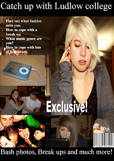
This is my first draft of my front cover. I have specifically used a mid-shot photo as the background for my front cover. This has worked really well because i was able to place of photos around it and for it to not look that busy.
I have also included a strap line, including my title of the magazine. Also a bit of inside information which will be explained in detail inside the magazine. This will hopefully attract the readers attention.
I have also include a bar code and the price to make my magazine seem realist. Also included a few photos which have been taken in and around the college, and this will also attract the readers and make them want to read more into the magazine.
Good blog Sophie and good cover. There are a couple of things you could improve but the main thing is your masthead becuse it's quite small, it's difficult to know if it's a masthead or a strapline. I think it could be bigger and bolder
ReplyDelete