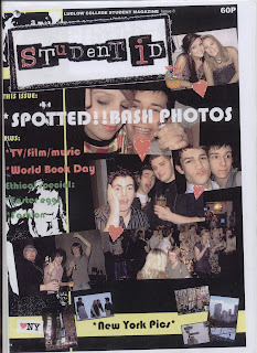
Secondly i am analysing the front cover of issue 8, ludlow college student magazine.
The front cover is covered in photos which have happened at a previous event. The phtos are eyecatching and really colourful for the audience to look at. Also, the photos at the bottom of the cover, are from 'new york' which is what some of the students went on previously. The title at the top of the page is eyecatching, and in two different fonts colours. It is a range from capital letters and lower case letters.
The background used is dark, so all the font which as been put onto the front cover, has been made to stand out and contrast with thr background. The font varys from large font, to small font, i think this is to emphasis how some things are more important for the audience to read.
The photos are of stduents who are at the ludlow college bash. Typically they all have alcholic drinks in their hands.
Layered on top of the photos are love hearts, which make the photos stand out more and make them seem important.
The price is also important on this magazine, because it makes it seem more realistic for the audience.
There is side headings on the side of the magazine. This gives an insight of whats happening inside the magazine. It draws the audience in and makes them what to read more inside the magazine.
On the new york photos there is a picture of 'NY', and a heart next to it, to show that the student who visited new york, really enjoyed it.
There is a banner at the bottom of the front cover, which emphasises the New York pictures.
Within the front cover, there is a picutre which has been placed on the cover which is of a basket full of easter eggs. This links to the period of time which theis may have been produced, around easter time.
This is aimed at young students because there is lots of photos of students at the bash, and the sub-headings are something that students would like, and be intrested in.


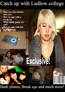
 Here i have created another student magazine, but i have used another different photo of a student as the backgound, and i have included a strapeline at the top of the page, and i have included exclucive text, barcode, masthead, and an image.


